Designing navigation for the next gen of Ford vehicles
Telenav was engaged by Ford to design the navigation experience for SYNC4, Ford's next-generation infotainment platform, launching across a new lineup of Ford and Lincoln vehicles. It was a new platform and new vehicles, built right from the start.
Design and document the full navigation experience for SYNC4, across Ford and Lincoln, ready for production. The hard part wasn't research; it was delivery: one cohesive, brand-appropriate, production-ready experience across four screen sizes and two brands, in a waterfall model where the docs must be complete before development begins.
As the sole UX designer, every decision had to count: the specs had to anticipate questions before they were asked, hold up under review by Ford program managers, and be precise enough for a remote engineering team in China to build from. Getting it right before handoff wasn't a preference; it was a requirement.
B2B2C
Telenav acted as a consultant to Ford, delivering a navigation product that would live inside Ford's broader infotainment ecosystem. That relationship shaped everything: the work had to fit Ford and Lincoln's established design systems and brand guidelines, and feel native to the IVI environment around it.
Adapting a reference product
A reference navigation product already existed internally. My job was to adapt it for production, knowing what to carry forward, what to modify, and what to rethink entirely for each screen and brand.

Consultant to client
Consulting means working within a client's processes, priorities, and constraints, not just your own team's. Decisions had to hold up in Ford's review sessions, not just internal ones.
One product, two brands, four screen sizes
Four screens spanned the lineup: Ford's 8", 12", and 15", plus Lincoln's 13.2". All were landscape except the 15", which was portrait. So the challenge was not only a size range from 8 to 15 inches, but a flip in orientation, all carrying one cohesive navigation experience without losing intentionality at either end.
Ruthless prioritization for small screens
The smallest screen forced hard calls about what's truly essential while driving. Every pixel was deliberate; nothing made it on screen without justification.

Safety consideration for larger screens
A larger screen isn't simply "more room." At 15 inches, touch targets have to suit real driving conditions: where an arm reaches comfortably, where glancing is safe, how information density affects cognitive load. All designs follow NHTSA guidelines.

How I approached it
I started with the 12" screen as a baseline (closest to the reference) to establish the core interaction patterns, information architecture, and component behaviors, then scaled in both directions, often working across sizes at once to pressure-test decisions.
What I designed
My focus was the UX: the flows, wireframes, and the production specs the build ran on. A UI designer applied the visual styling and a cartographer tuned the map. The screens here are how that work came together in production.
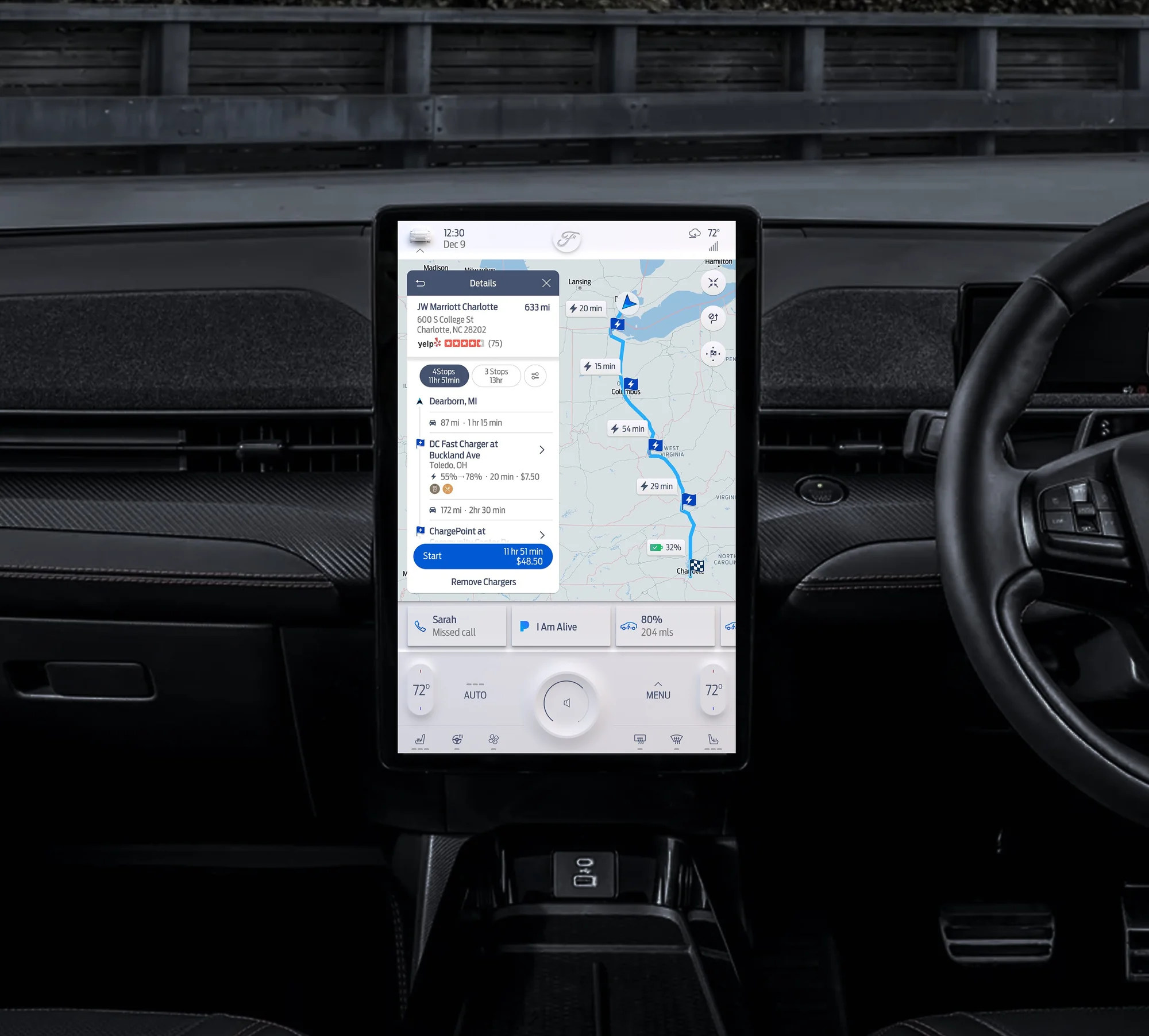
The map view is the primary canvas. Here it is in both brands, the same layout styled to each:


Let's dive deeper...
Search & POI


Navigating stakeholders needs
The waterfall challenge
In waterfall, the documentation isn't a living artifact; it's a contract. The specs have to answer every question a developer will hit, often raised long after I'd moved on to the next feature. That pressure means thinking several steps ahead of the build.
I ran regular review sessions with Ford program managers: presenting interaction flows, walking through behavioral specs, and fielding feedback that balanced UX quality against program constraints. Pushbacks and change requests were part of it; we worked through them across disciplines to a shared decision, then revised the Confluence docs to match.
When a decision was genuinely contested, or we needed confidence before committing it to the docs, we ran studies to validate the direction.
Specs thorough enough to build from
I produced the detailed UX documentation in Confluence that the engineering team in China relied on as their primary build reference. With no quick in-person clarifications, it had to stand on its own.
This wasn't high-level guidelines, but granular, element-level spec work. For every screen and feature, I documented what existed, how it behaved, and every possible state.

The Design Home, the top of the spec tree: around sixteen feature areas, each expanding into sub-feature pages covering every state, size, and brand.
Interaction flow diagrams
End-to-end flows for every navigation feature, showing how users move through the product and how the system responds at each step.

Element callouts
Each screen annotated with callouts identifying every UI element: its name, purpose, and exact behavior within the navigation context.

Full state coverage
For every element, I documented all possible states so engineers had no ambiguity.

Thorough documentation is invisible work, but with a remote team and no margin for misinterpretation, it mattered as much as the design itself. The Confluence specs became the shared language between UX and engineering.
Writing state-level specs sharpened the design too. Thinking through every state, including edge cases and errors, surfaced gaps in the interaction model before they became engineering problems.

Shipped in millions of production vehicles
The navigation experience shipped in production Ford and Lincoln vehicles as part of the SYNC4 platform, across the F-150, Bronco, Lincoln Aviator, and Lincoln Nautilus. The 15" portrait variant, designed for the Mustang Mach-E, was completed but did not reach production due to contracting changes.
In all, the work covered the full navigation feature set, around sixteen feature areas, each broken into multiple sub-feature spec pages documenting every state, across the four screen sizes and both brands. It earned consistently positive feedback from Ford's program managers.

Designing within constraints
Constraints like brand guidelines, an existing design system, safety standards, and a reference product can feel limiting. Here they were clarifying, forcing sharper thinking about what actually matters to the driver, and what doesn't.
Leading it solo also reinforced how much of great UX lives in communication: aligning stakeholders, documenting precisely enough for engineers across time zones, and knowing when to advocate for the user versus work within the system.
The documentation discipline I built here, specs thorough enough to remove ambiguity for a remote team, has shaped how I approach handoff on every project since.

